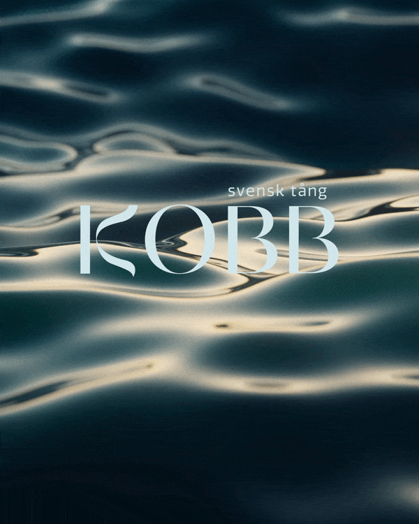
Client: KOBB Svensk Tång
2022
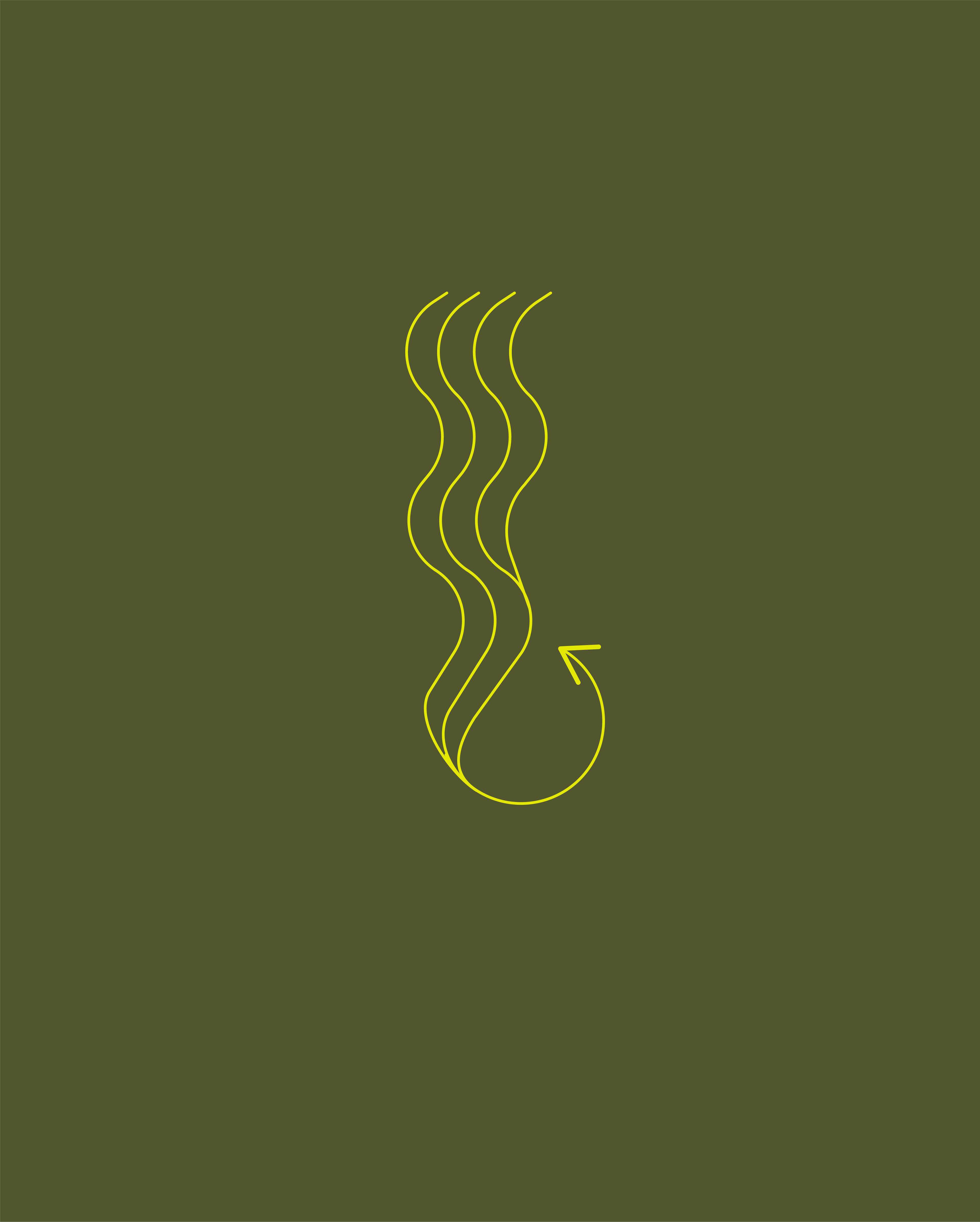
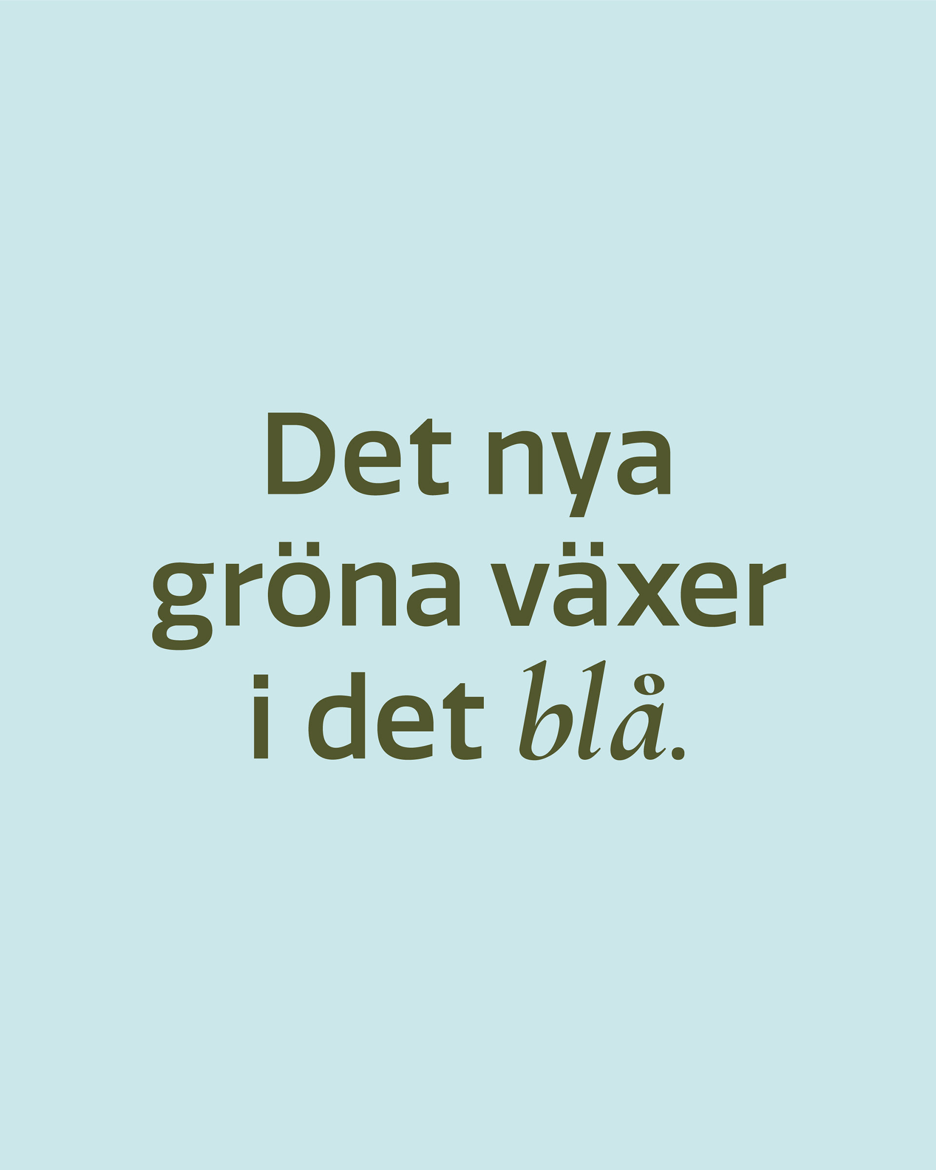
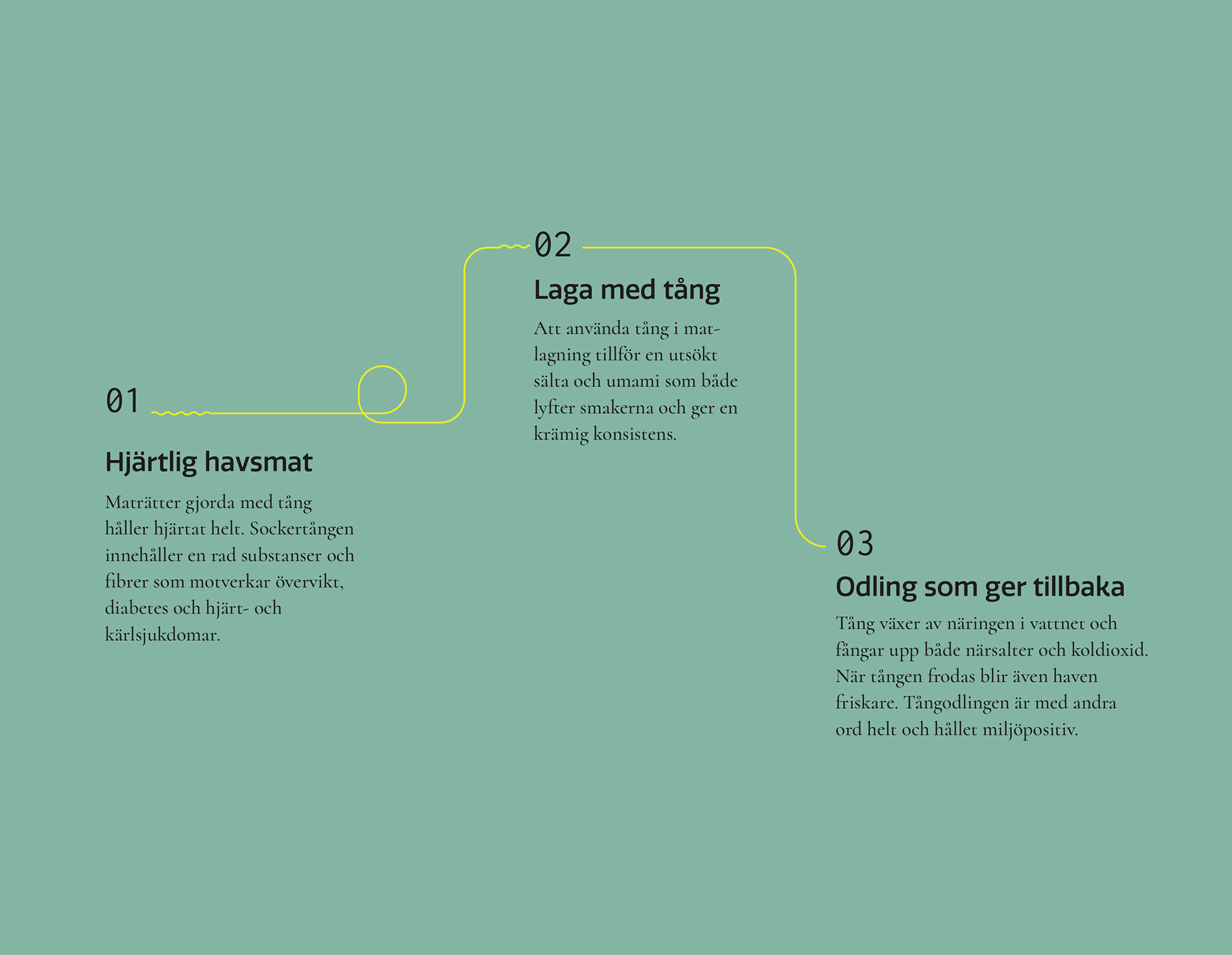
Case: Seaweed has quickly risen in popularity as a versatile ingredient in both food and products, boasting numerous health benefits. While I was at The Compadres, we where thrilled to help Kobb, formerly known as Bohus Seafarm, rebrand with a fresh new name and identity that embodies their purpose. The name Kobb, inspired by the Norwegian word Kobbe, meaning "small rock in water," captures the essence of their coastal roots. The logo, paired with a bold and crisp color palette and fluid graphics, creates a brand identity that is easy and approachable, just like we want seaweed to be to the consumer.
Team:
Copy - Johanna Börnell
Art direction - Me
Copy - Johanna Börnell
Art direction - Me