Client: Gunnars Båtturer
2020
Case:
Case:
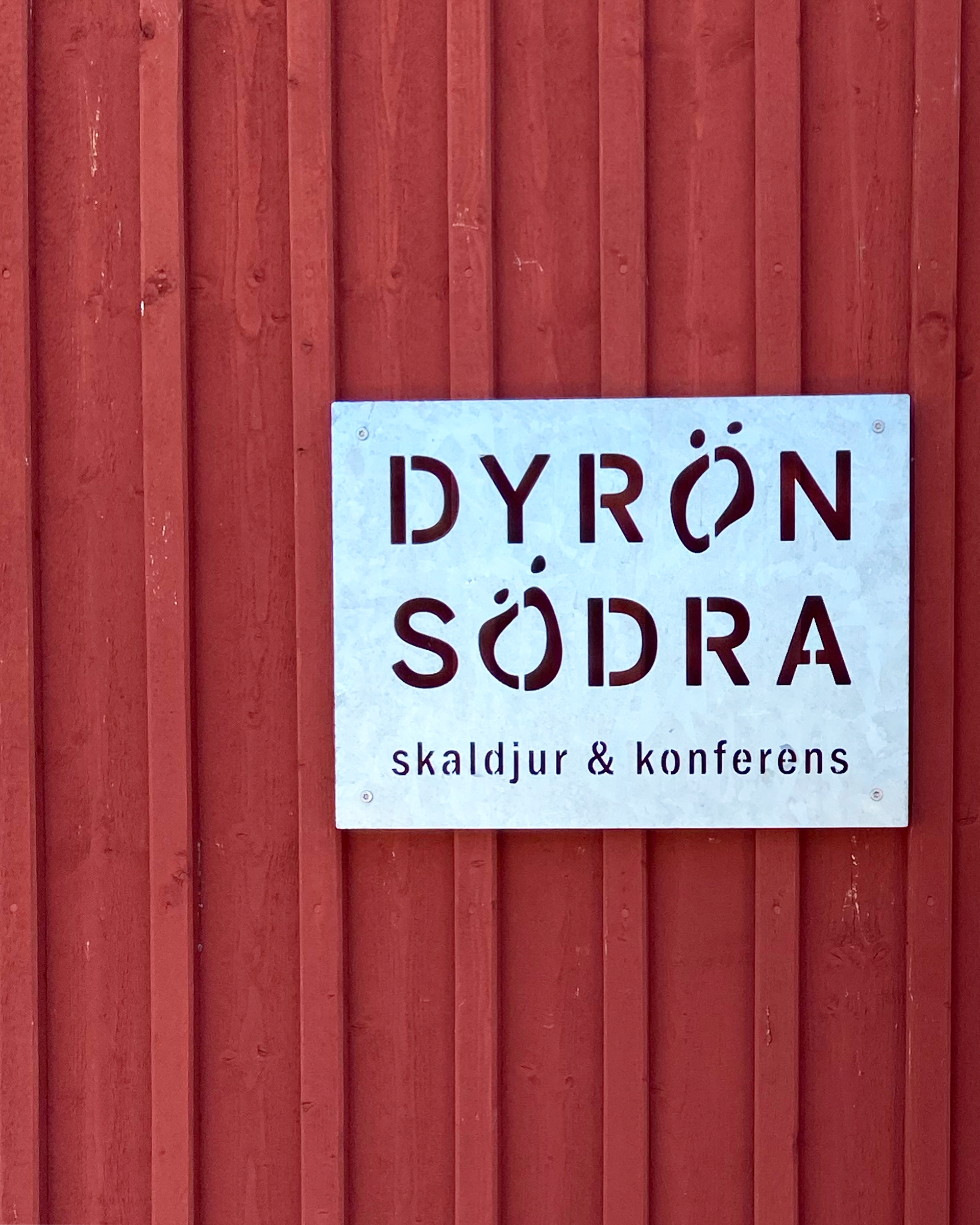
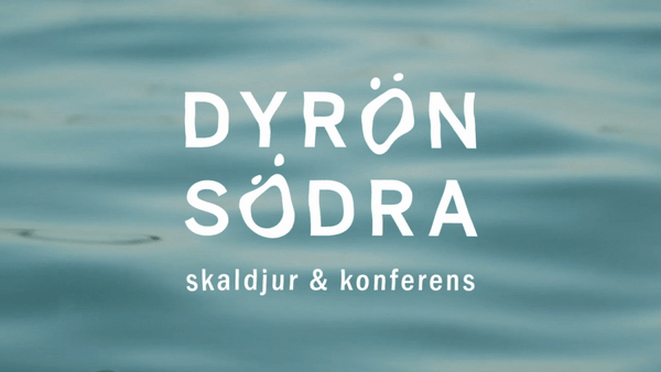
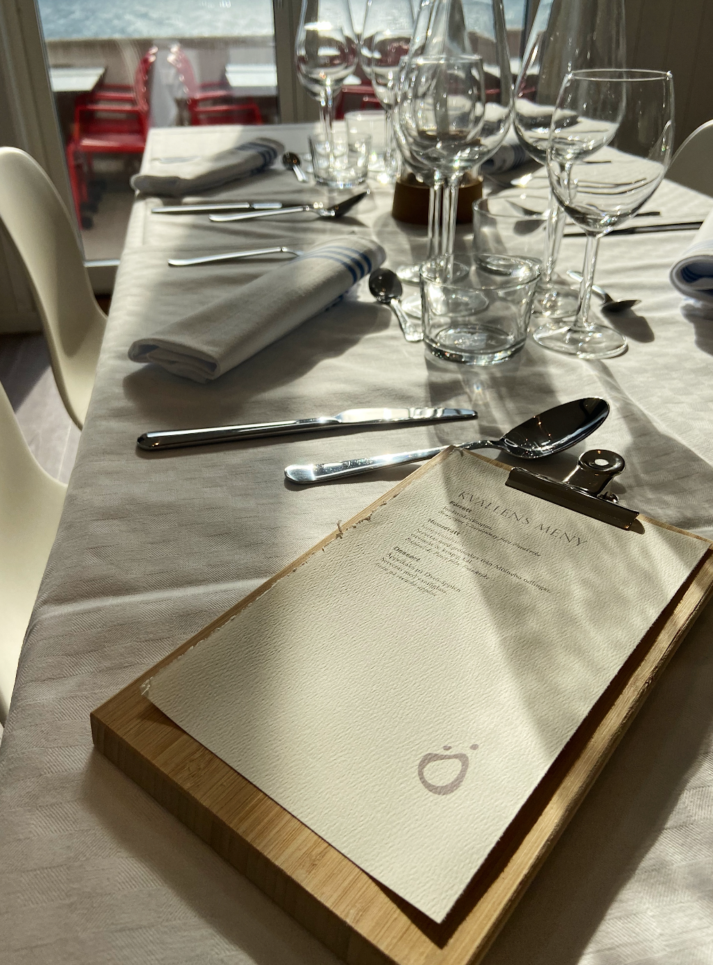
I had the opportunity to create a unique logotype for a new conference business located on Dyrön, an island in the western archipelago of Sweden. My inspiration came from the building's closeness to the water, which led me to think of waves and the fluidity of motion. I knew I wanted to incorporate these elements into the design to convey the essence of the island and the business it represents.
After conducting research and sketching various ideas, I came up with a logotype that incorporates a wave-like shape with a sleek and modern font. The wave shape represents the island's natural surroundings and the fluidity of the conference business, while the font adds a touch of professionalism and sophistication.